Agentic AI Data Visualization - 10 Rules Everyone should Actually Use
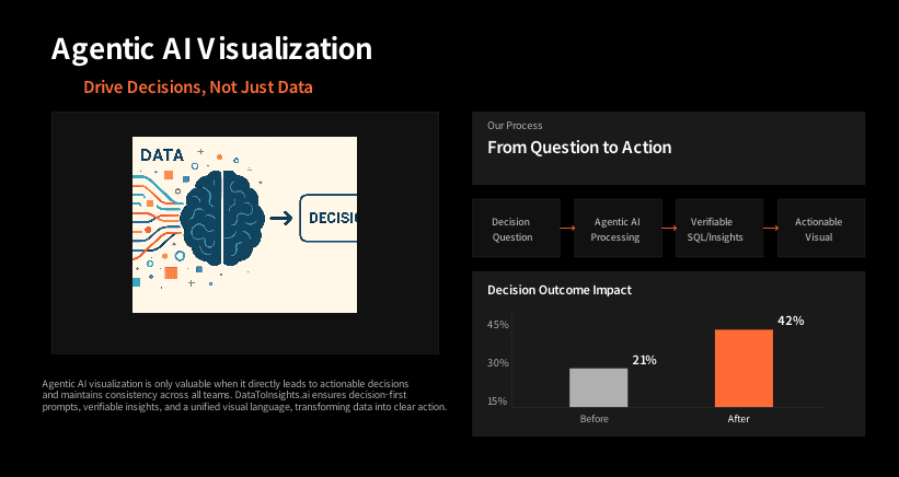
Agentic AI is useless if the visuals don’t drive a decision, trace back to the truth, and stay consistent across teams. We built DataToInsights.ai to make that the default, decision-first prompts, verifiable SQL and lineage, a governed semantic layer, and visuals that follow one visual language with fast insights.
So, Here are some learnings from that Execution.
1) Start with the decision, not the chart
Write the decision question first (“Should we shift 10% budget from A to B?”). DTI: You ask in plain English; the agent generates the answer with verifiable SQL and renders a visual aligned to that decision.
2) Match chart to relationship
Trend → line, compare → bars, correlation → scatter, distribution → hist/box. DTI: The agent recommends the safest encoding for the task and explains why.
3) One takeaway per chart
If a chart has two stories, make two charts. DTI: It pushes detail into small multiples or a drill, not clutter.
4) Color is a signal, not wallpaper
Neutral context plus one accent. Keep meaning consistent across pages. DTI: Built-in color semantics (e.g., goal, variance, forecast) and accessibility checks.
5) Keep scales honest
Bars start at zero; non-zero axes get called out; units and time are explicit. DTI: Scale guardrails and auto-annotations so you don’t accidentally lie.
6) Standardize the language of visuals
Pick a house style and stick to it like labels, formats, variance markers. DTI: Ships with an enterprise style guide so every team reads charts the same way.
7) Put context beside the number
Benchmarks, targets, YoY/plan variance right in the chart—no hunting. DTI: Auto-overlays baselines/targets and adds smart callouts on peaks, drops, anomalies.
8) Build a clear hierarchy
Top row = outcome KPIs. Next = drivers. Bottom = diagnostics. Minimal, meaningful filters. DTI: Pages assemble as KPI → driver → detail, with 2–3 filters that actually matter.
9) Truth before polish
Fix definitions, joins, and freshness first then style later. DTI: Governance-first pipeline with a semantic layer, tests, and lineage attached to every visual.
10) Close the loop and iterate
Show it to someone outside the project; if they can’t explain the takeaway, refine. DTI: Review mode captures feedback; agents refactor layouts as goals and metrics evolve.
Fast checklist of mistakes to avoid
- Stacked bars when you need precise comparisons
- Rainbow palettes and inconsistent color meaning
- Non-zero bar baselines without a callout
- Screenshot “reports” that go stale and lose trust
- 20 filters no one uses; pick the two that drive decisions
- No lineage, no approvals, no audit trail , aka “agent-washing”
How DataToInsights.ai makes agentic viz production-ready?
- Decision-first prompts to interactive visuals, You ask a business question then, we return verifiable SQL, the chart, and a plain-English rationale.
- Governance baked into the workflows.
- Semantic layer, data tests, and end-to-end lineage travel with every insight.
- One visual language: Consistent themes, labels, and variance markers across teams and pages.
- Accessible by default: Contrast/palette checks and color-blind-safe options out of the box.
- Explainable & auditable: Every visual comes with sources, assumptions, and scale decisions, no black boxes.